Photography
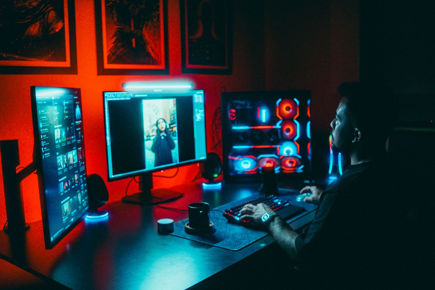
Photography direction based on stock images: real people at work, product in context, natural light and cool color toward Ink. Includes token overlays and keywords to search.
Base: stock images
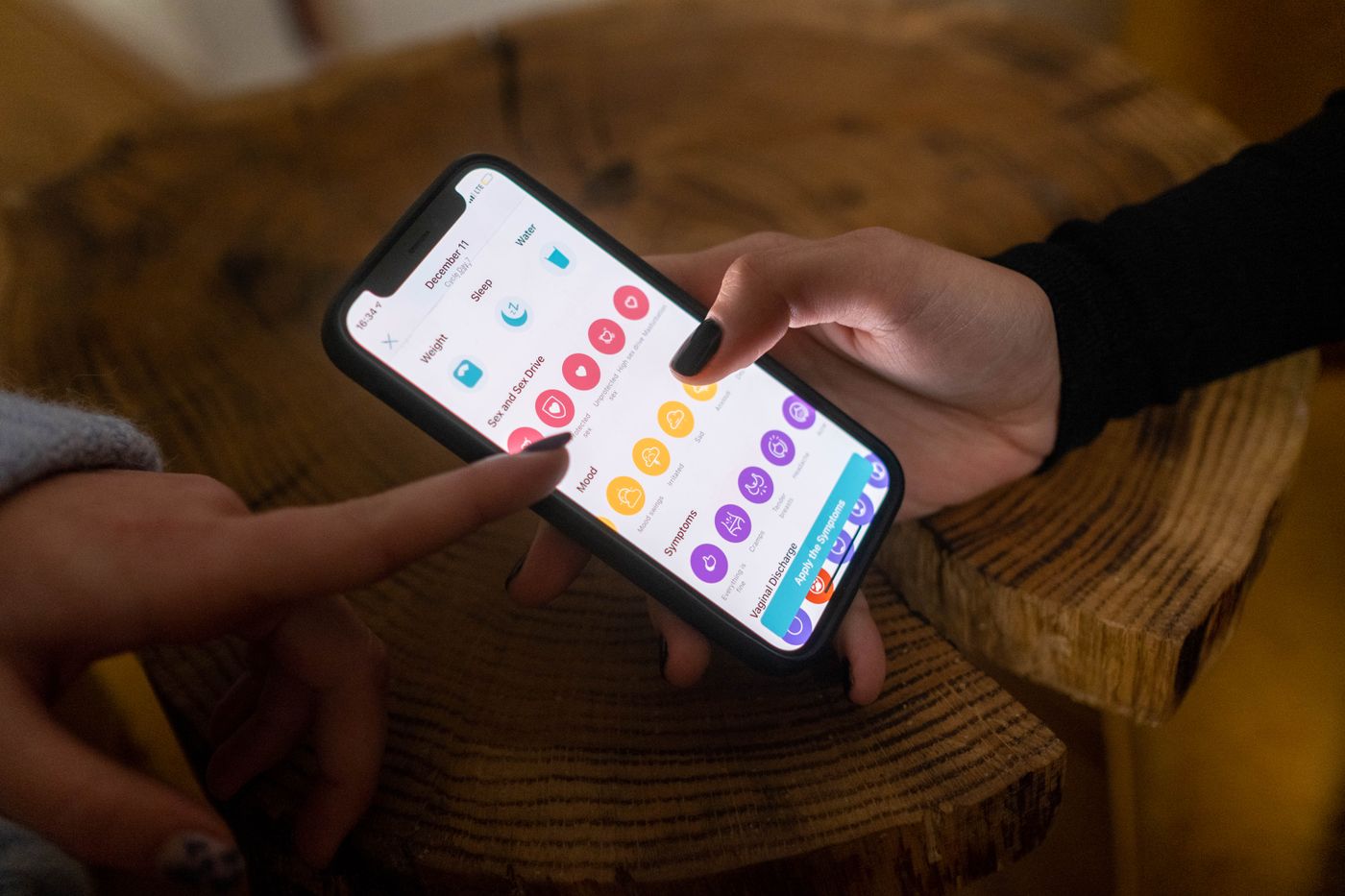
Starshot has no photos of its own for now. We work with stock images chosen with these criteria so they look real and consistent. The examples on this page are neutral placeholders: replace them with the chosen photo.
Principles
Light and color
Natural light, from the side and soft; indoors with windows. In low-key shots, the screen is the source of blue light. Cool, neutral color grading: clean whites and shadows leaning to Ink (#021627), not pure black. A touch of color-brand-blue (#006AFF) in the setting if it shows up naturally. Moderate saturation (-10 to -15). No warm or vintage filters, no duotone except for specific campaigns. color-accent-violet and color-accent-star are not used in photos.
Subjects and composition
Leave a third of the space free for headlines. Keep horizons and screens straight. Crop with radius-card (12 px) on cards and radius-none full bleed.





Overlays on photos
Text on a photo with an overlay: always text-inverse and a minimum contrast of 4.5:1 where the text goes. Do not stack two overlays or use gradient-brand as an overlay.


Keywords to search
Filters: dominant color blue or neutral, horizontal orientation, people aged 25 to 55. Suggested stock sites: Unsplash, Pexels and Adobe Stock; always check the license before using an image.
What to do and what to avoid